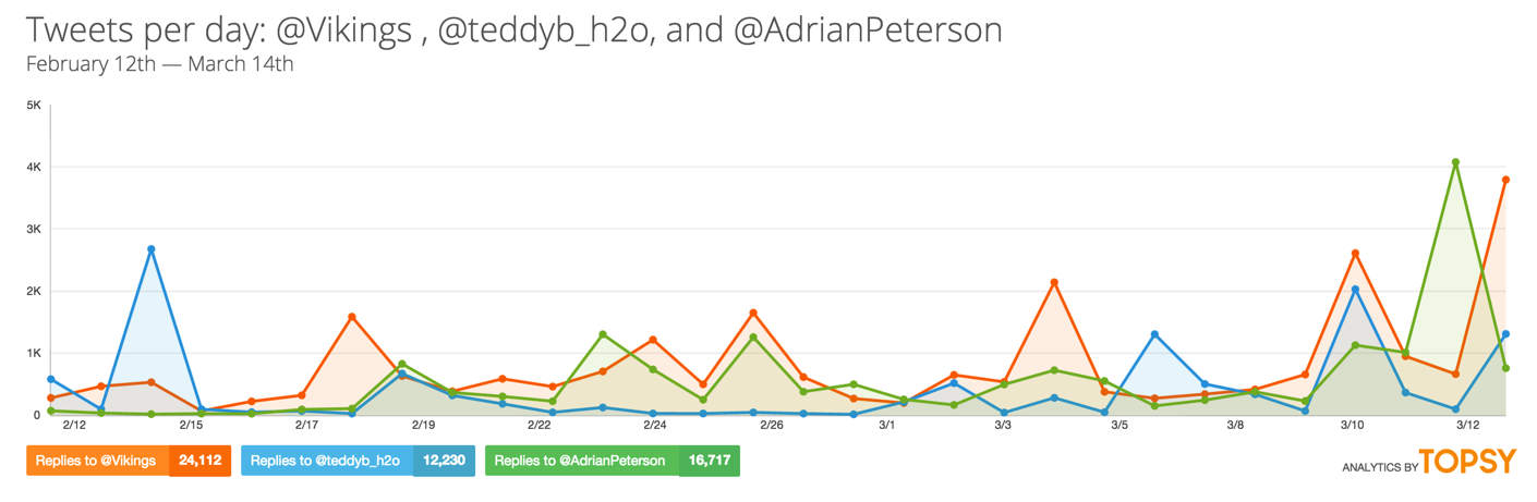
Recently I’ve been thinking of ways to detect bias as well as look into what makes people share. Yes understanding dynamics and trends over time, like the chart below (Topsy is a great simple, free easy tool to get basic Twitter trends), can be helpful – especially with linear forecasting. None the less they reach their limits when we want to look for deeper meaning – say at the cognitive or “information flow” level.
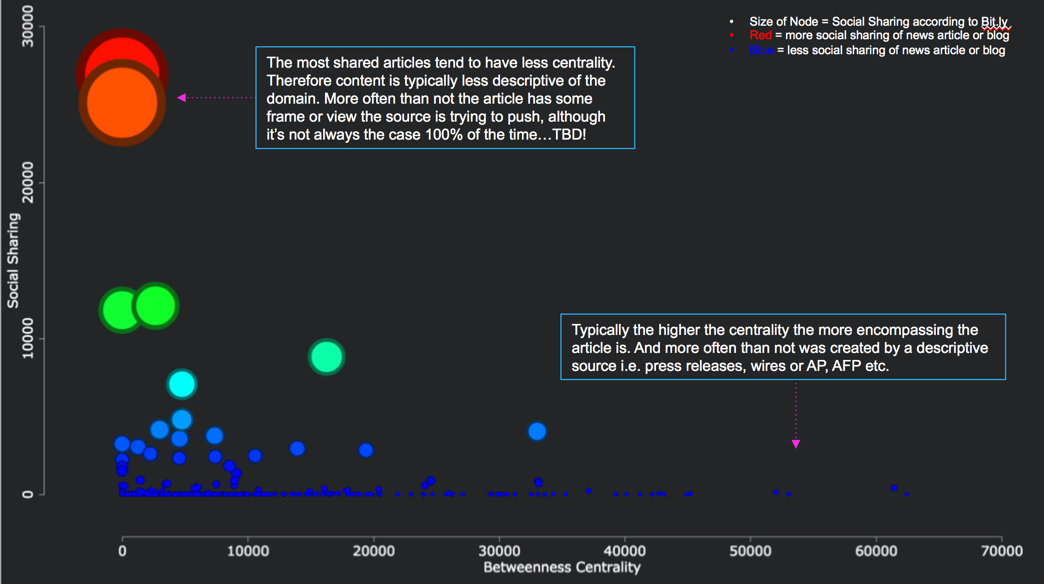
Enter networks. This enables an understanding of how things connect to and exist at a level that is not possible to do with standard KPIs like volume, publish count and sentiment over time. Through mapping out the network based on entities, extracted locations, and similar text and language characteristics it’s possible to map coordinates of how a headline, entities or article exists and connects to other entities within the specific domain. In turn, this creates an analog of the physical world with stunning accuracy – since more information is reported online every day. For example, using to online news articles and Bit.ly link data, I found articles with less centrality (based on the linguistic similarity of the aggregated on-topic news article) to their domain, which denote variables being left out (of the article), typically got shared the most on social channels. In short, articles that were narrower in focus, and therefore less representative of the broader domain, tended to be shared… This is just the tip of the iceberg.